Data maps that often go hand in hand with news stories tracking COVID case numbers can be effective at imparting knowledge of case rates, but they do little to change perceived infection risk and opinions toward public health recommendations, finds a research letter published yesterday in JAMA Network Open.
Because of this ambivalence, the researchers recommend that communicators use a per capita map that displays "heat" colors (eg, a color spectrum from white to red) at the state level to illustrate hard-hit regions.
This map composition would at least maintain public knowledge, they said, but overall, "The findings of this survey study suggest that simply providing maps with COVID-19 case information was not necessarily associated with improved public knowledge, risk perception, or reported intent to adhere to health guidelines."
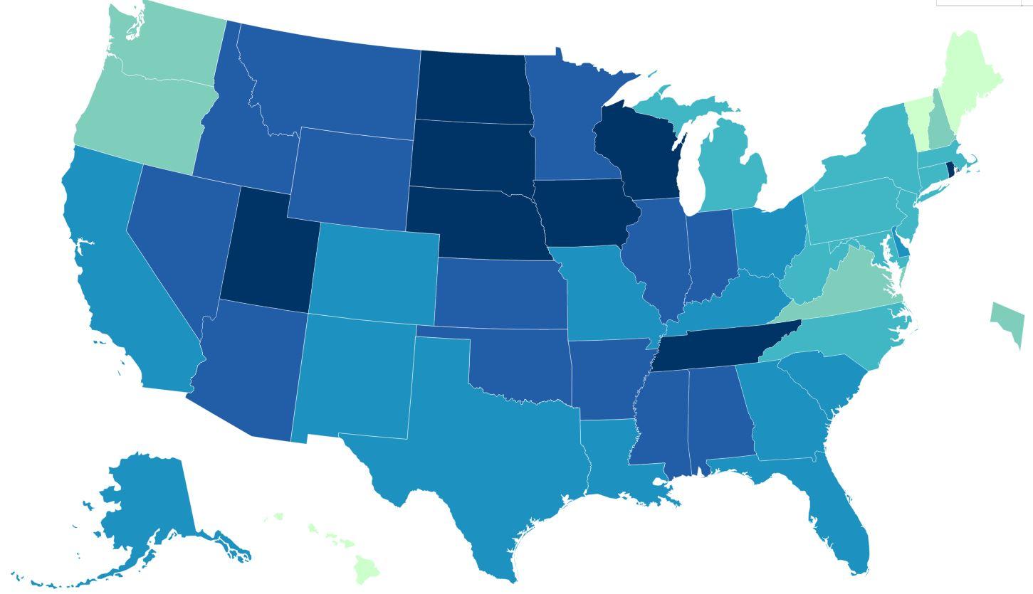
The investigators assessed responses to maps from the Centers for Disease Control and Prevention, Kaiser Family Foundation, University of California-Davis, New York Times, and two from Johns Hopkins University.
Map options varied: combinations of heat (color coding) versus bubbles showing caseload, state versus county delineation, and per capita versus total cases.
Map absence associated with higher optimism
The researchers recruited US adult respondents from May 18 to 28, 2020, via Qualtrics online panels, and 2,675 respondents answered questions on knowledge (evaluated on a scale of 0 to 1), risk perception (on a scale of 1 to 7), and behavioral intention (on a scale of 0 to 100) based on one of the six map options or no map at all.
On a binary level, the presence of any map resulted in a 5% decreased knowledge of total cases but a 3% increased knowledge about cases per capita. Maps of any type were also associated with a lower societal risk perception and higher optimism that the pandemic would be better in 2 weeks (3.77 vs 4.02; 95% confidence interval [CI], -0.48 to -0.02 difference).
The presence or lack of a map did not matter for individual risk perception (3.83 vs 3.79), nor did it affect intentions to adhere to COVID-19 guidelines (87.83 vs 86.09). In general, respondents self-reported a high willingness to adhere to COVID guidelines (86.33 overall).
A number of the metrics comparing different map compositions were not notable to the researchers, but they did find that respondents more accurately answered per capita questions when looking at heat vs bubble maps (0.48 vs 0.44; 95% CI, 0.01 to 0.06 difference) and state-level vs county-level maps (0.49 vs 0.45; 95% CI 0.01 to 0.07 difference).
Unsurprisingly, per capita maps enabled respondents to better answer per capita questions (0.42 vs 0.56; 95% -0.16 to -0.11 difference), and total case maps helped with total case questions (0.60 vs 0.46; 95% CI, 0.11 to 0.17 difference).
Diverse education in respondents
While the study didn't collect respondents' locations, it did note that the average age was 46 and that 38% were not white, with 17% Hispanic and 12% black. Education level varied, with 38% obtaining a high school education or less, 47% with some college education or a 2-year degree, and 15% with a 4-year college degree or above.
"Based on the findings of our survey study, we encourage map developers to be mindful of the potential influence of reporting strategies on public knowledge and perception of the pandemic," the researchers write.
"Knowledge about strategies for effective communication of COVID-19 case information would benefit from research with other stakeholders, such as government officials or policy makers."